Building a unified editorial system for a high-impact policy report
Building a unified editorial system for a high-impact policy report
Designing a multi-channel visual language that elevates clarity, trust, and readability for complex immigration research.
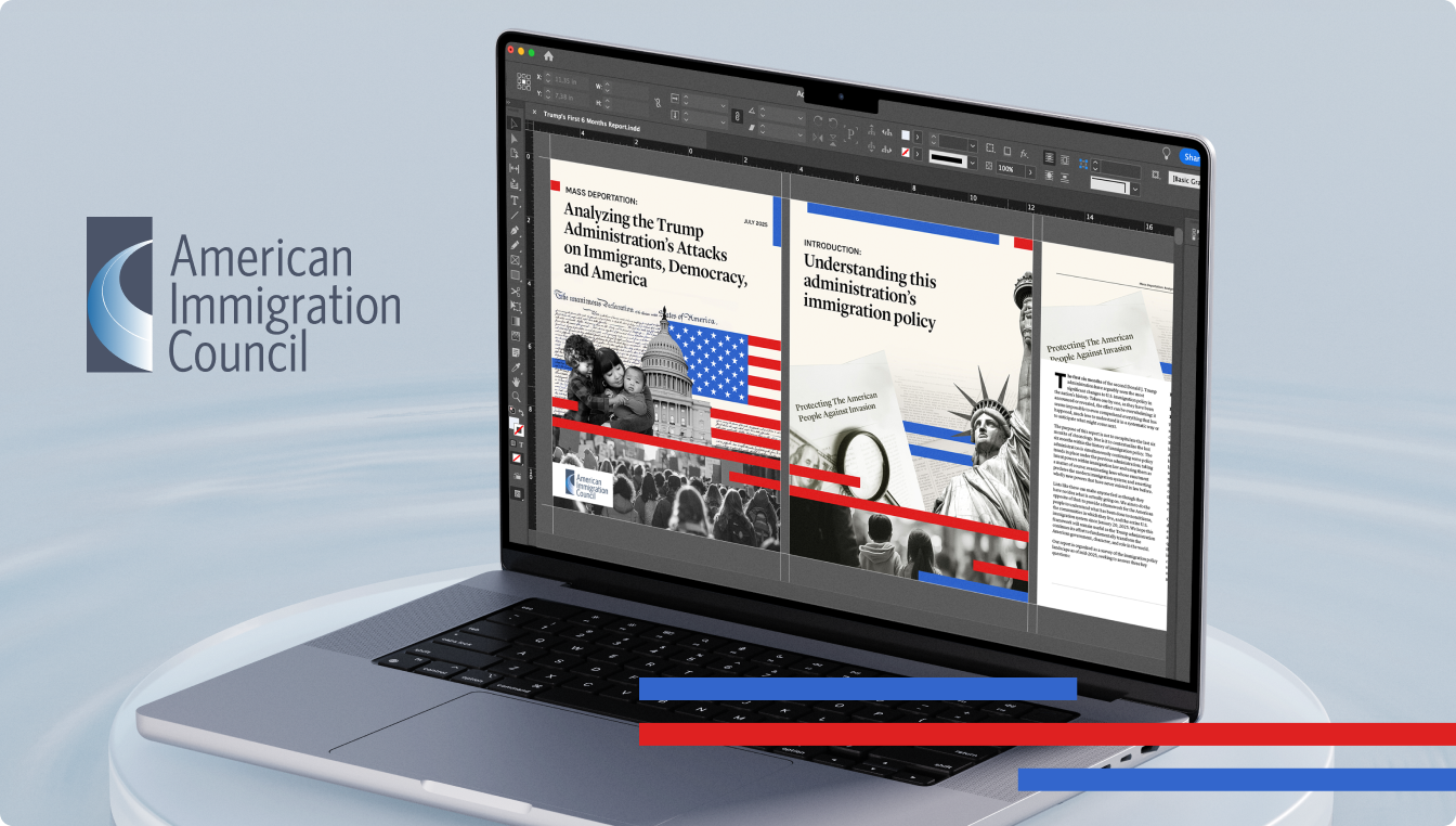
The American Immigration Council commissioned Brangho to redesign the visual communication for their Trump’s Six-Month Report — a comprehensive analysis of the administration’s early immigration policies.
The goal was to create a strong editorial system that worked seamlessly across print, digital, and social formats, ensuring consistency, readability, and a unified message across all channels.
We delivered a complete design framework used for the report itself, mobile-friendly adaptations, and a cohesive visual identity for supporting materials.
Challenges
The Council needed to present complex policy data to a broad audience — policymakers, journalists, advocacy groups, and the public. Key challenges included:
Approach
We developed a flexible editorial system built around consistency, clarity, and a trusted visual voice.
Our approach included:
- Establishing a clean grid and typographic scale for long-form content
- Using patriotic color accents (red, blue) as structured visual markers
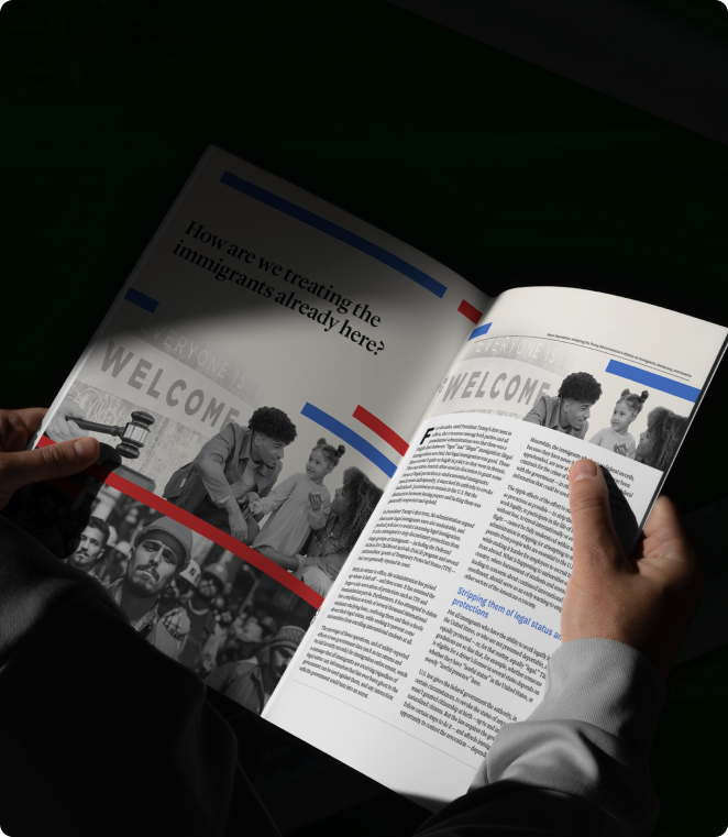
- Integrating black-and-white photography for emotional context without overwhelming the narrative
- Designing strong section openers and break-pages to guide readers through complex topics
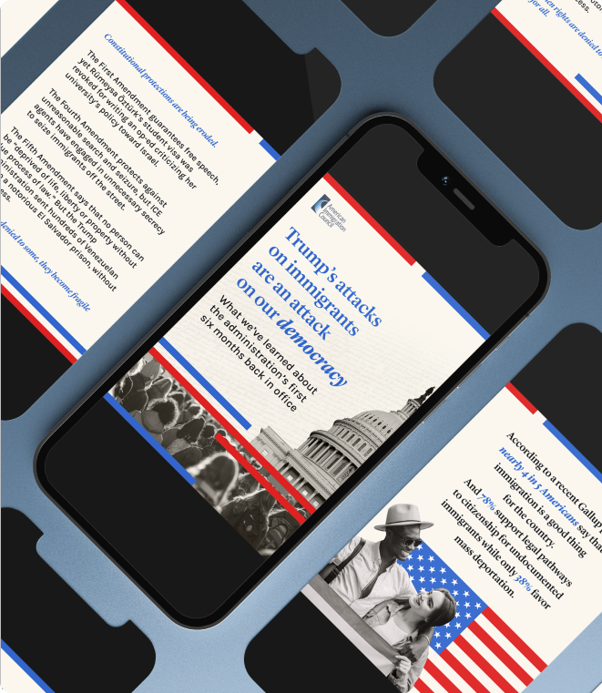
- Translating the report's design into mobile-friendly formats for social media distribution
- Creating a navigation-friendly experience that encourages scanning and deeper reading
Key Additions
A modular layout system for all report sections
Custom color-coded dividers for policy categories
Mobile-first social templates for key excerpts and data points
Scalable components usable across future Council reports
Optimized spacing and accessibility improvements for long-form reading
Design Highlights
Print Report:
A complete editorial structure featuring bold openers, structured typography, and photo-driven storytelling.
Photography System:
Black-and-white documentary images paired with red and blue vector accents to maintain neutrality and clarity.
Cross-Channel Consistency:
The same visual logic applied across print, web, and social formats, ensuring message alignment.
Mobile Content:
High-contrast layouts adapted for small screens, preserving headline hierarchy and key research insights.
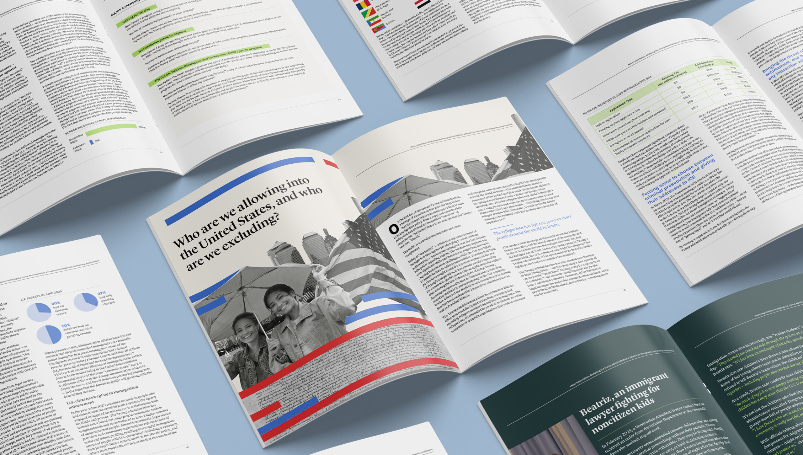
The new visual system helped the American Immigration Council present sensitive, data-driven content in a clear, authoritative, and accessible way. The unified design strengthened trust, improved readability, and provided the Council with a reusable foundation for future policy publications and advocacy materials.
Let’s talk about your next project
Tell us a little about what you need, and we will get back to you within 2 business days.

