Creating a cohesive brochure suite for a language services leader
Creating a cohesive brochure suite for a language services leader
Bringing consistency, clarity, and warmth to ALTA’s visual communication across multiple audiences and industries.
ALTA Language Services, Inc. — a U.S.-based, employee-owned company specializing in language testing, translation, and interpretation — approached brangho to redesign their marketing materials.
The goal was to unify visual identity across all brochures and ensure alignment with ALTA’s professional yet approachable tone of voice.
We developed a full brochure system covering diverse industries and services, from healthcare and finance to public sector and education, maintaining consistency across structure, typography, and imagery.
Challenges
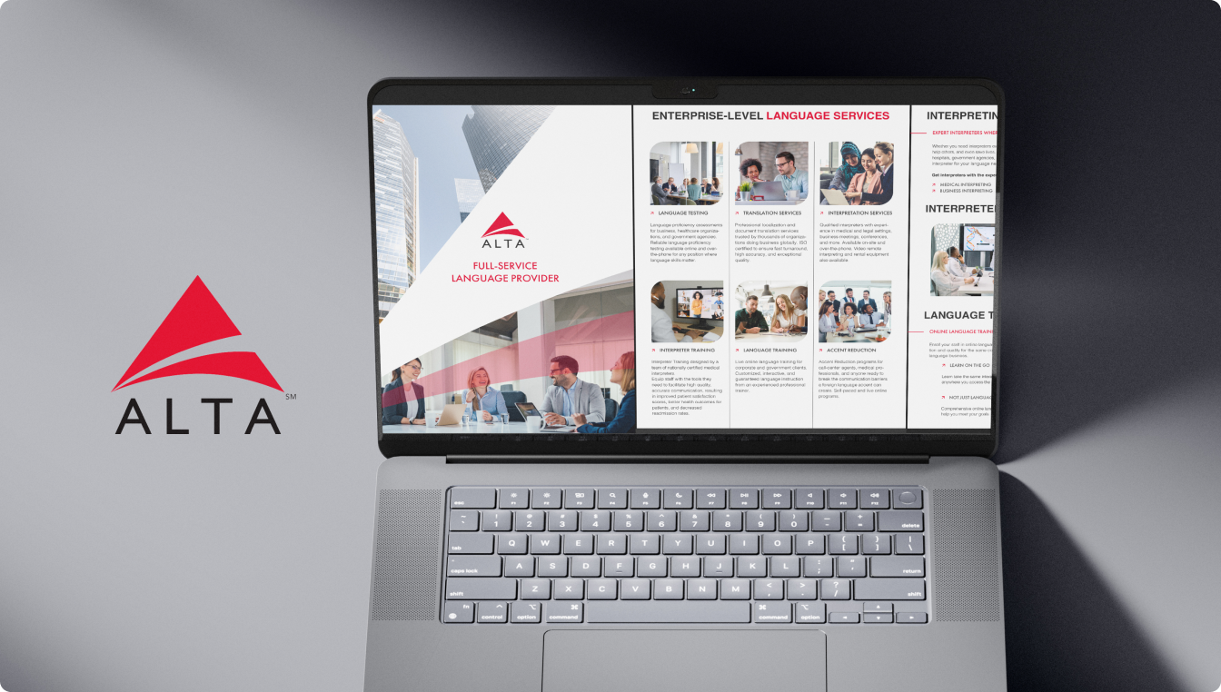
ALTA had numerous brochures for different sectors, but their design lacked coherence and didn’t reflect the company’s updated tone and brand direction. The team needed a consistent design language that would:
Approach
We began with a deep dive into ALTA’s Writing and Design Guidelines — understanding their AP Style preferences, tone of voice, and ISO-certified quality standards. Our focus was to create a visual system that complements ALTA’s linguistic precision with a clean, modern aesthetic.
Key design principles:
- Minimalist layout with clear hierarchy
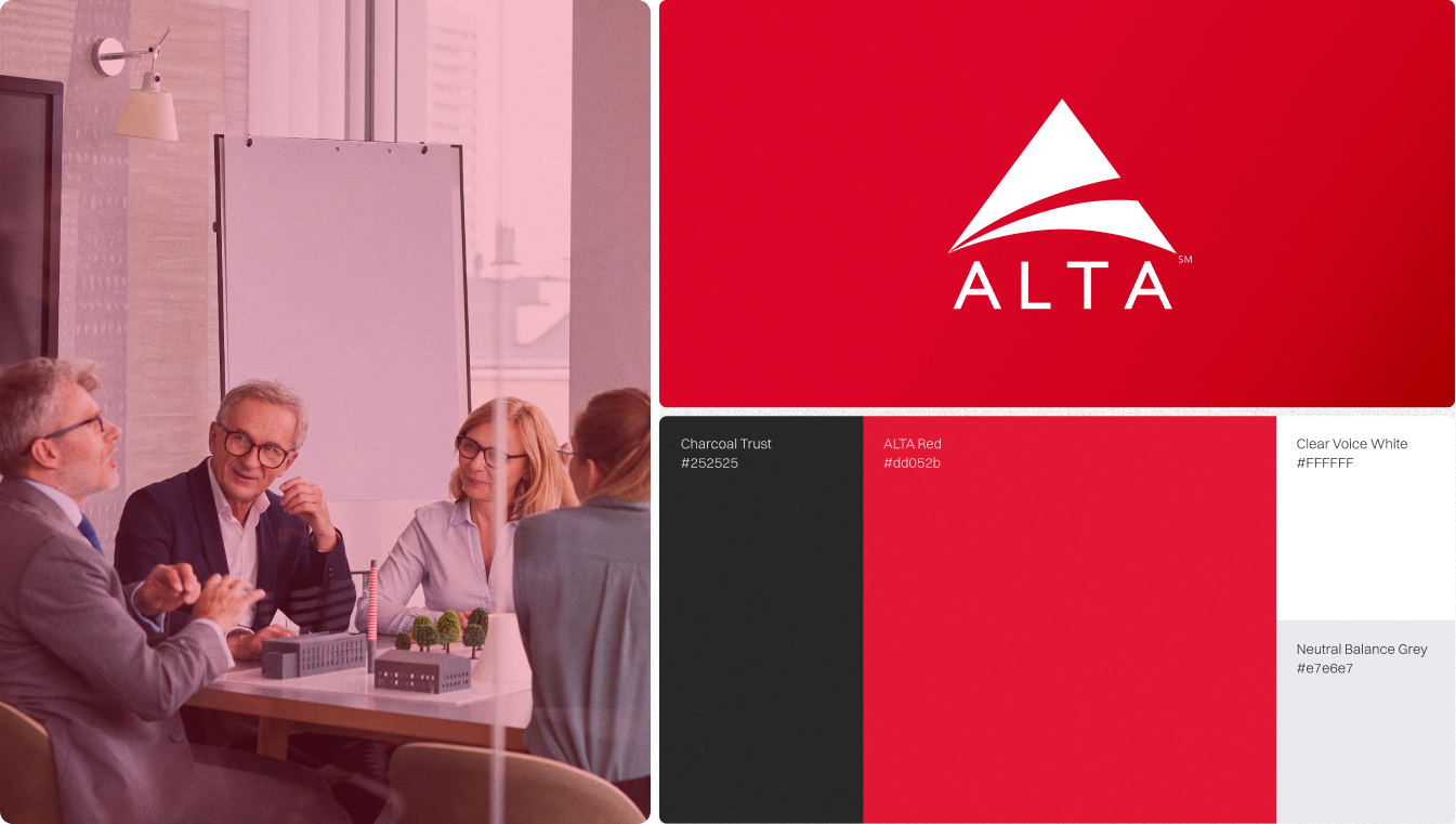
- Consistent use of ALTA’s color palette — PMS186 red, black, white, and gray
- Sans-serif typography (Helvetica/Futura) for clarity
- Balanced use of photography with geometric frames and controlled white space
Key Additions
Unified brochure system covering all service areas
Harmonized grid system and typographic scale
Custom InDesign templates with editable text and image placeholders
Defined use of photography frames and call-to-action highlights
All templates were built in Adobe InDesign to enable easy updates by the ALTA team.
Design Highlights
Brochure Suite:
12+ industry-specific brochures (Healthcare, Finance, Education, Public Sector, etc.)
Visual Consistency
Reusable templates ensure brand cohesion across materials
Ease of Use
Modular design allows internal teams to update or localize content
Tone Alignment
Visual tone mirrors ALTA’s friendly, consultative, and professional brand voice
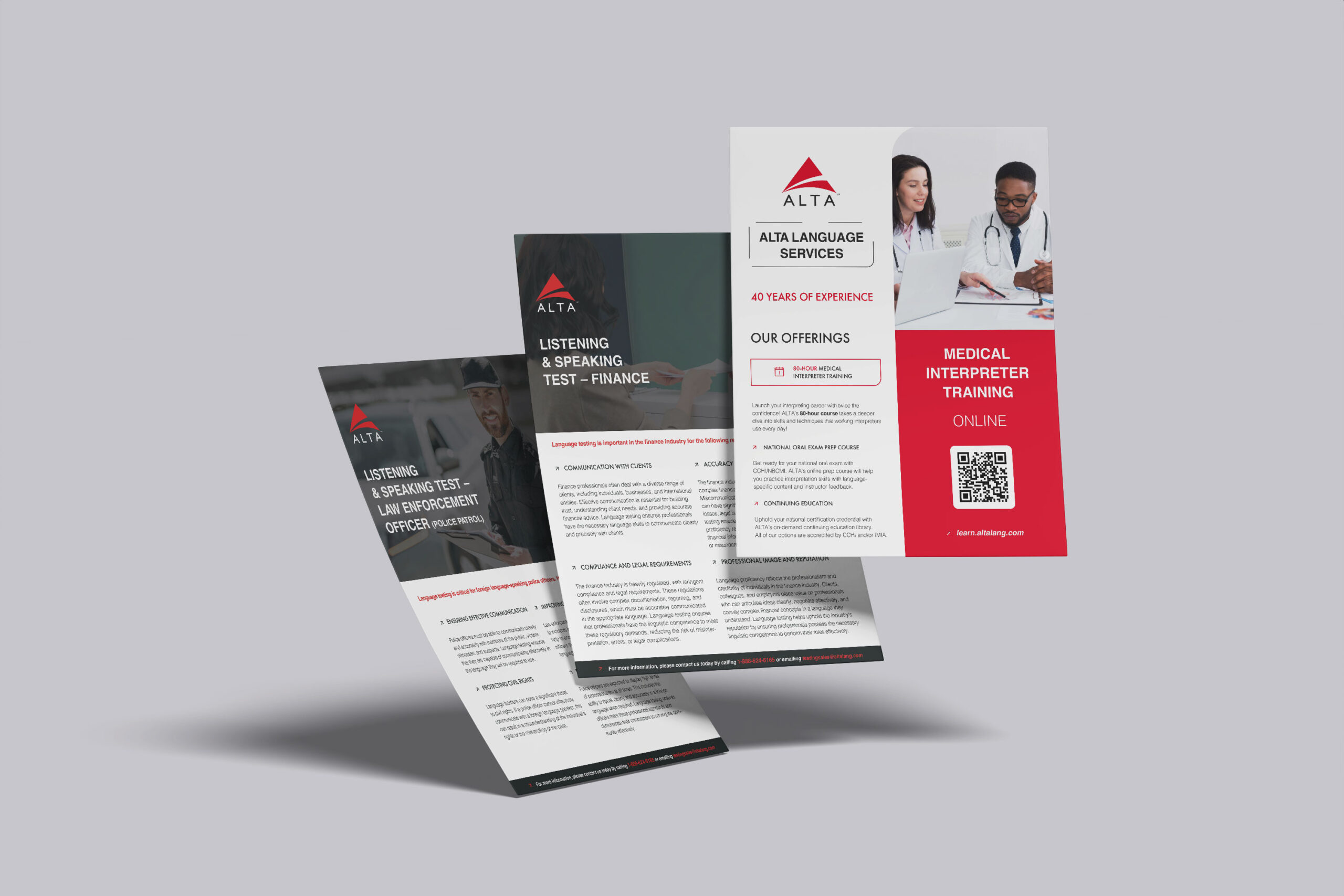
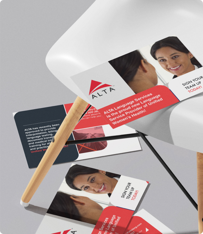
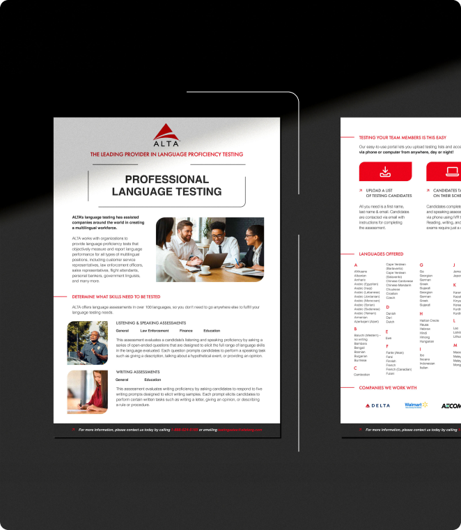
The new brochure suite provided ALTA with a consistent, professional, and approachable set of materials that elevated their brand communication.
The templates became a key part of ALTA’s marketing toolkit, helping their team quickly produce on-brand collateral for every client segment — from interpreters to corporate partners.
Let’s talk about your next project
Tell us a little about what you need, and we will get back to you within 2 business days.

